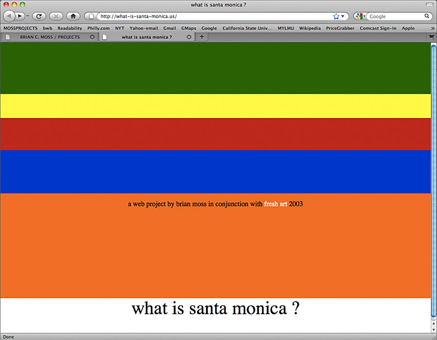
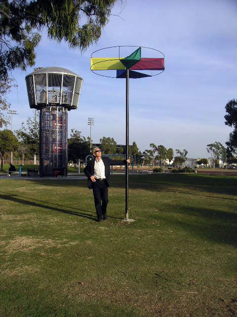
What is Santa Monica? Us. 2003, was an eight week project situated in Clover Park and funded by the Santa Monica Public Art program Fresh Art. In addition to banners, steel and fabric was used to create kinetic sculptures in the form of pie-charts and bar-graphs spinning in the wind on poles over the park. The project asks questions about demographics and how the configuration of data affects perceptions of what is represented. A website (publicized on the banners) linked back to historical and demographic information about Santa Monica, as well as providing links to other local public art and a searchable database of Santa Monica history available to all.
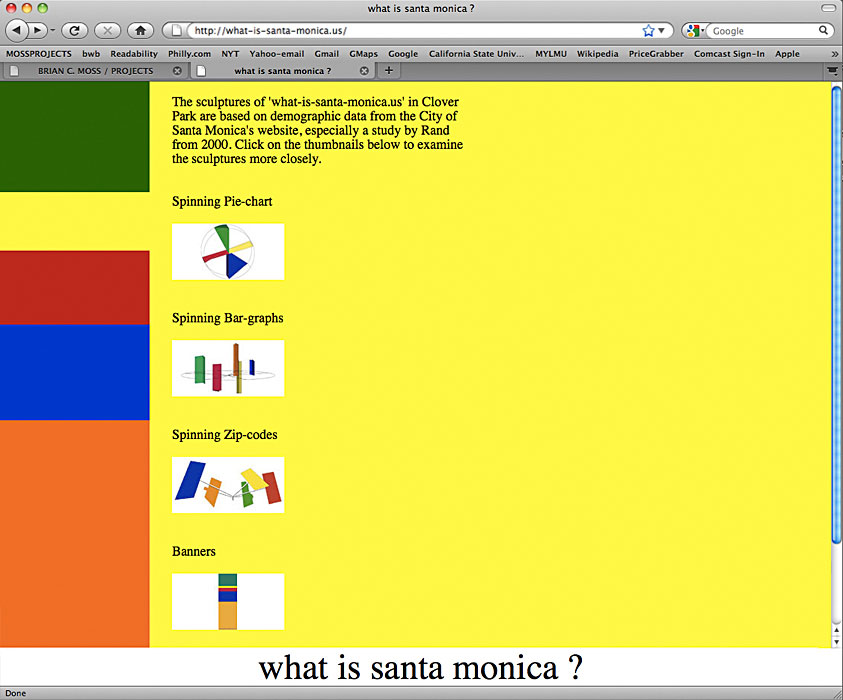
Page leading to sculptural data from the what-is-santa-monica.us website.
The Spinning Pie-chart sculpture was based on the racial and ethnic make-up of the City of Santa Monica, as found in a 2000 study by the Rand Corporation. Santa Monica's majority population of "whites" are represented in the sculpture as the clear areas through which the sky can be seen. This is the only scupture where the colors do not represent the five Santa Monica zip-codes.
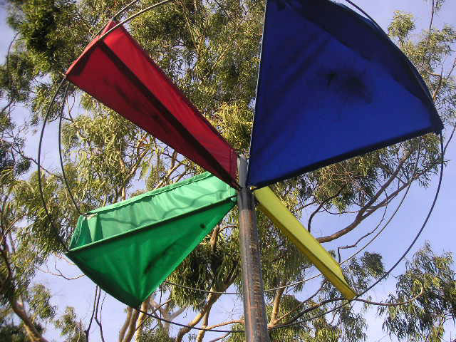
Spinning Pie-chart
detail of kinetic sculpture, 2003, metal and nylon, 12 x 6 x 6 feet
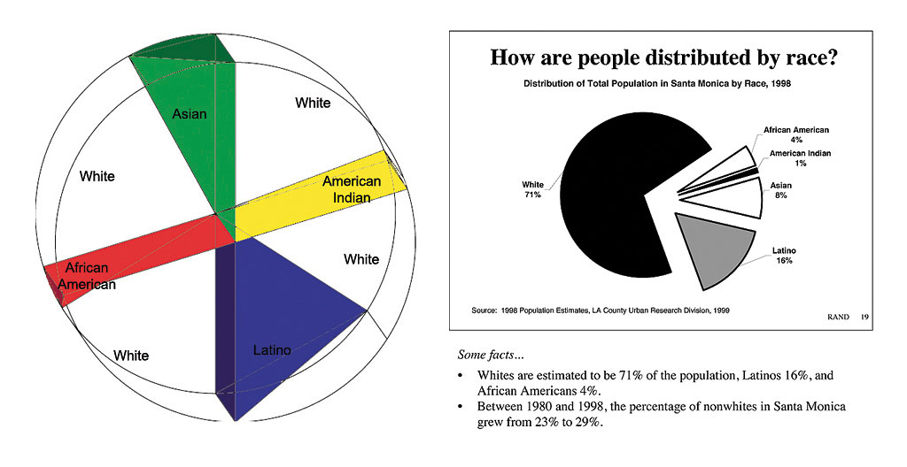
data for Spinning Pie-chart
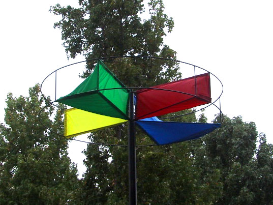
Spinning Pie-chart
2003, kinetic sculpture: metal and nylon, 12 x 6 x 6 feet
Spinning Pie-chart
detail of kinetic sculpture, 2003, metal and nylon, 12 x 6 x 6 feet
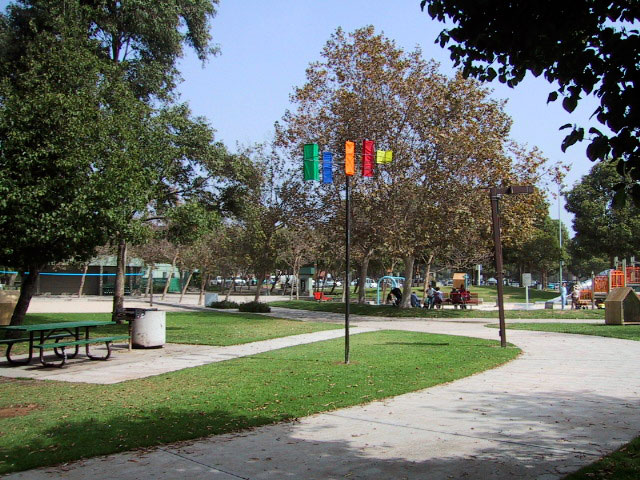
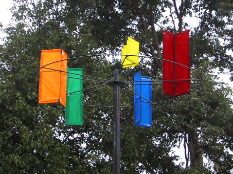
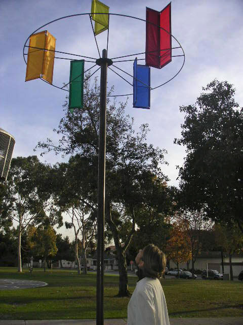
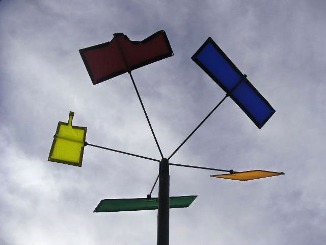
The Spinning Bar-graph sculpture is based on two different data groups from the Rand study; the average annual income and the distribution of population in each of the five zip-codes of the City of Santa Monica. The horizontal circle in the middle of the sculpture represents the zero point in the graph, with incomes pointing up toward the sky and populations pointing down toward the ground. The colors here and in the Spinning Zip-codes and Banners represent the five Santa Monica zip-codes.
Spinning Bar-graph
detail of kinetic sculpture, 2003, metal and nylon, 12 x 6 x 6 feet

data for Spinning Bar-graph (by zip code) showing average household income above and percentage of Santa Monica population below the center line
Spinning Bar-graph
detail of kinetic sculpture, 2003, metal and nylon, 12 x 6 x 6 feet
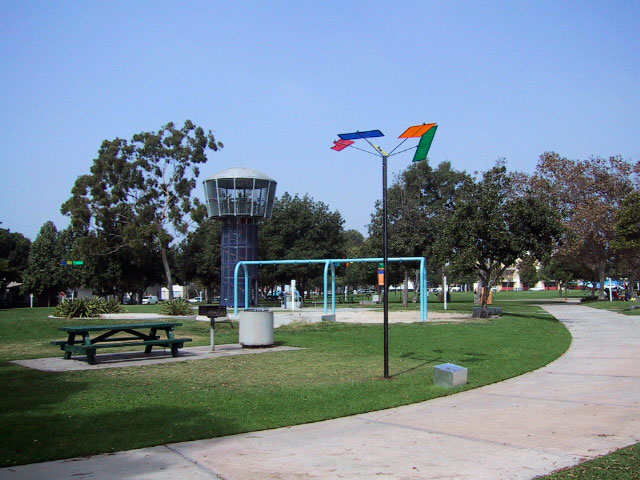
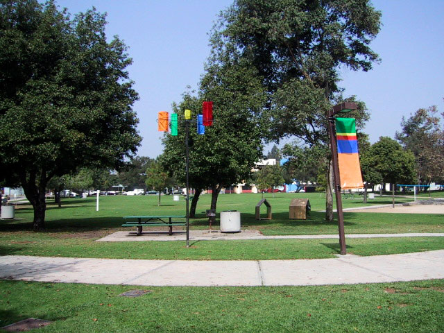
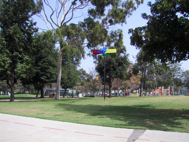
The Spinning Zip-codes sculpture is based on the geography of Santa Monica, as found on maps from the City of Santa Monica's website, and in the Rand study. The colors here and in the Spinning Bar-graphs and Banners represent the five Santa Monica zip-codes.
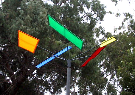
Spinning Zip-codes
detail of kinetic sculpture, 2003, metal and nylon, 12 x 6 x 6 feet
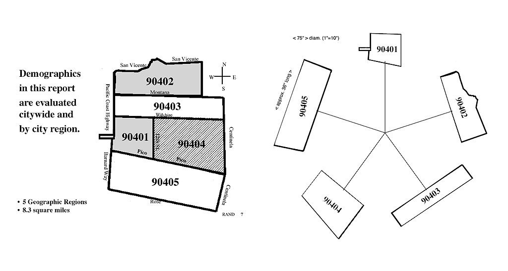
source map for Spinning Zip-codes
Spinning Zip-codes
detail of kinetic sculpture, 2003, metal and nylon, 12 x 6 x 6 feet
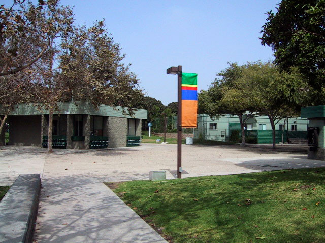
The Banners are based on the distribution of poverty found in Santa Monica based on the Rand study.
2003, inkjet on vinyl, poles and hardware, 72 x 24 inches each
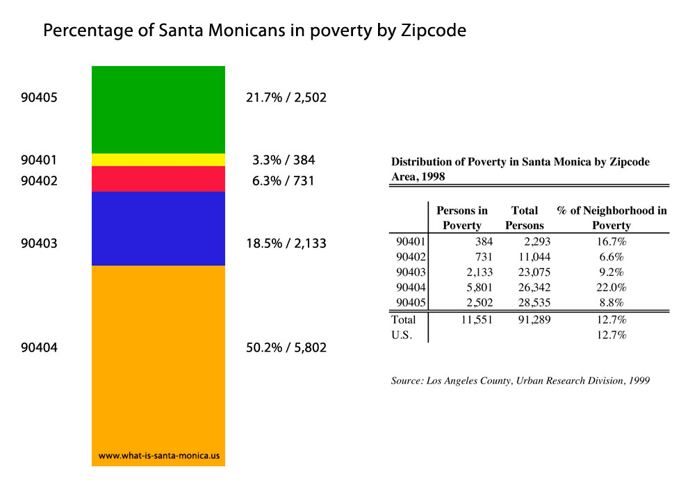
Banner data: it should be noted that only half of the Santa Monica residents who live in poverty actually receive public assistance. Another interesting contrast between the data represented in the Rand study and that shown on the city's website is that Rand breaks down the data by zip code while the city chose to represent itself as a single entity. In addition, the city website does not show information like these poverty figures.